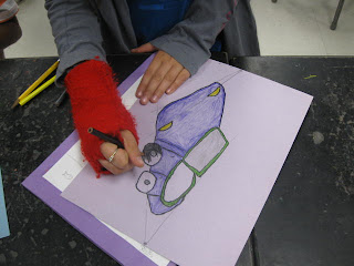
 The grid they used helped them draw the car from a 3/4 view. From this viewpoint you can see both headlights and two wheels, unlike a portrait or profile view.
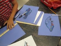
The 3/4 view creates an almost 3-dimensional feel. To enhance this, students created a light source on their paper. Where the light hit the car, they created white highlights to mimic reflections. In the shadows, they modeled color from dark to light.
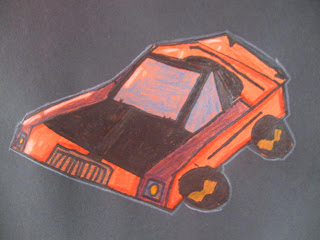
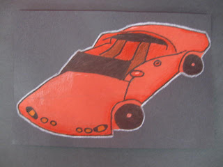
When they finished, they neatly cut their car out and mounted it on a black paper. They created a white outline on the edge of the car to help define its shape.


No comments:
Post a Comment